Pop-ups are an integral part of online marketing campaigns and a lucrative promotional tactic that increases conversion rates and sales. However, there are several things that you should take into consideration before using them.
Pop-ups can be a powerful tool for generating new leads and converting them into customers when done right.
However, pop-ups are an annoyance that will get the user to leave the site when executed poorly. If you’re going to use pop-ups on your website, read on to learn the do’s and don’ts of pop-ups.
What Is A Pop-up?
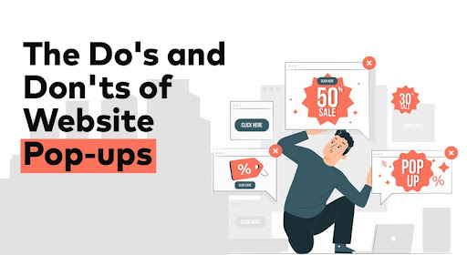
A pop-up is an interactive ad format that opens on top of the main page.
Pop-ups can be used to encourage a user to click through from the page they are viewing and visit your website, rather than passively reading your content. Pop-ups can also be used to tell visitors about a new product or a new feature on a website.
A pop-up can be triggered by more than one event; when a user enters a site, clicks on an image or text within the page, or even when they hover over certain elements with their cursor.
Must-have Website Pop-ups
Pop-ups are all around us. You can’t go through a day without seeing at least one. They’re annoying, they’re distracting, but they’re also often handy.
When used correctly, pop-ups can be a great way to grab the attention of your visitors, introduce them to new products, increase interaction, and even boost your sales. Here are 4 must-have website pop-ups.
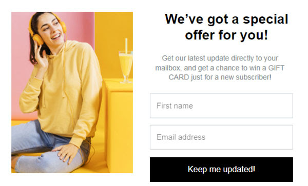
1. Exit-intent Pop-ups

To no one’s surprise, the exit-intent pop-up is first on the list.
Exit-intent pop-ups are a type of pop-up that appears when a visitor is about to leave a site. They are a good lead generation tool because they can convert visitors who might be less ready to buy into customers.
This can be because they were browsing and not ready to buy but could be swayed, or because they were on their way out and needed a reason to stay.
How to use exit-intent pop-ups?
Exit-intent pop-ups can be used to encourage new visitors to subscribe to your mailing list, offer a “Welcome Back” discount to returning visitors, and retain existing subscribers with relevant and engaging content.
2. Click-activated Pop-ups
The click-activated pop-up shows a message to the visitor and then disappears when the visitor clicks anywhere on the screen. This is the most basic type of pop-up, and they are often used as informational pop-ups or as a way to show a special offer.
How to use click-activated pop-ups?
The best way to use click-activated pop-ups is to place them where people expect to show up. For example, if you sell tickets to events, you could put a special offer pop-up under the “buy tickets” button.
3. Opt-in Bars

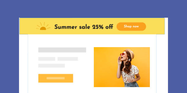
Opt-in bars(aka floating bars) are a feature that allows you to promote a product or a service, usually driven by a free download or a free trial. They are a simple but effective method of getting people to take a specific action online.
An opt-in bar can be placed across a website and will often have a button. This can be a physical button, a link, or a text link.
When a website visitor hovers over the bar, it will open up and give the user the chance to sign up for an email list. This will allow the business to send marketing materials to the user and track what marketing materials worked the best.
How to use opt-in bars?
If you’re running an eCommerce store, these can be even more effective as they can be used to promote specials and flash sales. Opt-in bars can be found on many sites and can be used for various purposes — from polls to quizzes and invitations to follow you on social media.
4. Interactive Pop-ups

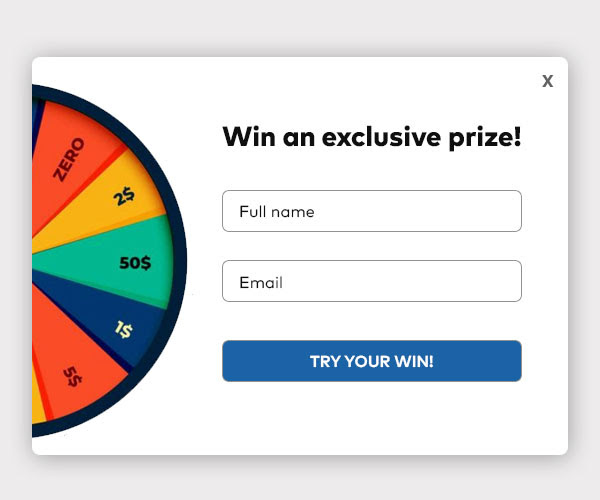
Every pop-up is an interactive element. What makes an interactive pop-up genuinely unique is the added value by taking the interaction one step further.
Interactive pop-ups can come in many forms, but what sets them apart from other traditional methods is the ability for users to feel more engaged while simultaneously encouraging people to aim higher.
How to use interactive pop-ups?
The opportunities are endless when brainstorming ways to implement your ideas into an interactive pop-up – whether you’re seeking to provide more information about potential customers or attempting to capitalize on increased conversion rates that can be achieved through gamification.
The wheel of fortune may seem like a random idea, but the satisfaction gained through winning prizes while experiencing a new level of engagement with your online presence can help increase sales tenfold.
Do’s Of Website Pop-ups
There are many aspects to consider with pop-ups.
- Context: Context is the message surrounding your pop-up content. For example, when the pop-up appears, the visitor will better understand the content you are offering before navigating your blog page. So, the context is everything, and they increase the conversion rate of pop-ups.
- Make the pop-up clear and exciting: Let people know what they can expect when visiting your blog, and don’t spam. Moreover, try to personalize that will get your visitors to trust in different ways.
- Deliver the promised value: If you promise your customers that they have a special deal, you must. For example, if you’ve promised an e-book, make sure it’s easy to download and formatted for easy access.
- Time wisely: Make use of the data from previous campaigns and evaluate the frequency and visibility time. So that you don’t overdo it or do the opposite!
Don’ts Of Website Pop-ups
These four points reduce the inconvenience for the user:
- Don’t scare the first-time visitors with an immediate pop-up; instead, be friendly and allow them to explore your site.
- Don’t interrupt user flow by forcing pop-ups on every page load; it makes users feel like you’re trying to steal from them instead of giving them something valuable in exchange for their attention.
- Don’t cover or obstruct the primary content on a page with the pop-up.
- Don’t use pop-ups for mobile users. Instead, replace them with a search bar.
Guidelines For Using Pop-ups On Website
Pop-ups are a controversial topic when it comes to website design. On the one hand, they’re a fantastic tool for getting visitors to take the action you want. On the other hand, they can be very annoying and lead to many visitors simply leaving your site.
So, what’s the best way to use pop-ups? Here’s a quick and easy guide:
- First, don’t annoy your users. Nobody likes to be bombarded with pop-ups, so don’t bombard your users. You will lose their trust, and they will leave. And if you do have to use pop-ups, don’t be too pushy.
- Second, give your users an out. People have to have a way to get out of your pop-up. If you don’t give them a way out, you’re going to lose them.
- Third, don’t be aggressive. Using pop-ups to scare users into conversion is probably one of the worst things you could do.
- Fourth, know what you are doing. You need to understand what you are doing with your pop-ups.
There are numerous tools available on the market, but each has a slight learning curve to use. With that out of the way, many email service providers, like BayEngage and MailChimp, provide their own pop-up builders with attractive template collections.
Wrap Up
The average conversion rate for a pop-up is around 2%. So make sure your pop-up is personal to your visitor. This is a relatively new trend, but it’s a smart one. Instead of using a pop-up which talks about a product or service to everyone, why not tailor the message to the individual?
Moreover, pop-ups are essential for marketers to keep their brands relevant, but they are often misused. We hope you can implement these do’s and don’ts to help you maximize the effectiveness of your pop-ups.
Also Read:
