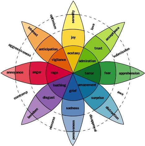
Irrespective of how advanced we get, as Humans; we can never deny our emotional aspect. This is the perspective that the digital realm is tapping, it seems.
With the limelight being targeted on user experience, creating emotional web designs sprinted into the design trends. The entry of emotions in the robotic world of digital advancements brought in a new storm.

This tweak gained momentum over the last few years and spiked in 2022. Taking a cue from this popularity, various brands are now catching up with this trend. The diverse emotions that their websites elicit have boosted the user engagement and honed the user experience.
Needless to say, now, website designers are looking for tips to adopt this trend into their sites. Here is all that you need to know about Emotional Web Design.
Emotions in Websites (3 Layers of Processing)
Web design agencies all around the globe have spotted three core levels for visual designs that can add up to be of help for designers. Based on these three aspects, the designers can imbibe in emotions into their products.
The three aspects have been drawn from the way that the human brain functions. Website designs can be made memorable, appealing, pleasurable, and effective based on these considerations.
Here are these three aspects
a) Visceral (Impressed)
This is the lowest level of emotional consideration that forms the pre-consciousness level. This aspect has a lot to do with the user’s initial visual impression that is basically dependent on the feel, appearance, and touch.
b) Behavioural (Intrigued)
For the behavioural angle, the design is all about the way we use the site, draw the experience from it, and how the website functions. As per this core angle, the web site design needs to be usable and understandable for the user. All that designers need to do is identify the user requirements.
c) Reflective (Involved)
The highest cognitive level, this level is capable of a higher degree in cognition, feelings, and emotions. Human beings are capable of reasoning with the entire world around them, thanks to this level. The reasoning aspect of the human mind has an upper hand over our emotional and automated behaviour.
As per this, the user takes into account the significance of the product, its cultural aspect, etc.
What are the Design Elements?
While the how and the why of website designing is now crystal-clear, there is still the clause of how to implement the emotional angle to website designing. The very first angle to this rests on acknowledging the emotional design elements that designers need to consider.
1. Dissonance
The human mind expects to locate elements that would help them fit in the world. Identifying these requirements of the users’ help the web designers understand the consistent structure that fits into the mental model of users.
Then again, playing with some dissonance with their set expectations may create the desired result owing to catching their attention.
2. Storytelling
Weaving a story into the website pulls on the emotional strings of the user and engages them. With the interest of the story, the user engagement time is substantially extended, thereby boosting the time spent on the site.
3. Animation
With animation, the chances are high that the attention of the user can be grabbed conveniently. With such animation, there are increased chances of clearing the clutter of the sites to create a clean design. Imbibing the CTA tone can also become pretty easy, along with easier and clean navigation.
4. Humour
Breaking the ice is always easier with humour. Whether it’s a slight smile on the face or laughter, humour is still the best emotional element. Post this emotion, websites can easily relate to the user, and hence, keep them occupied.
5. Tonality of voice
Tonal attributes are the core element to communicate for human beings. While written content seldom establishes it, graphics and single sentences can often set this tonality. All that designers need to do is get a hold over the targeted user’s preference.
6. Typography
With complementary typography to the website design, the visual impact is spiked. With diverse font size, colour, customized twists, they themselves become website designs. This often sets the tonality of the site and forms a substantial impression on the targeted audience.
7. Colours
Colour psychology is a widely discussed subject in the world of marketing. Each colour has a specific impression on the viewer. Furthermore, colour schemes and its significance and impact on the viewer vary as per the cultural aspect of the viewer.
For example, white symbolizes peace for some locations, while it represents grief for others. Designers can have their desired impact on their users, provided that they know their audience well enough.
How to Apply the Design Elements in a Site?
With an in-depth idea about the emotional elements for website designing, developers and designers now need to know all about the steps involved in applying them.
Here are some of the tips listed out by pros to imbibe the emotional aspects to a website.
- Use visual elements
- Offer engaging experience with a unique theme and design styles
- Imbibe details to engage users
- Opt for smart and interactive interactions
- Use well-designed copy/microcopy for expressing emotions
- Ensure personalization of app/web designs with the creativity
Conclusion
Irrespective of how much we reiterate “I don’t want to be at the mercy of my emotions”, as Humans, we become subservient to emotions. As the digital world evolves, the need for such unique solutions becomes the need for the hour.
While users continue to get drawn to such sites, designers from the top web developing companies in New York are giving it their all to ensure the creation of such emotion-dipped sites. Why aren’t you catching up on these trends?
