
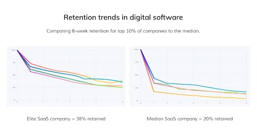
What is the difference between the top-of-breed SaaS apps and a median app? Let’s take a look at the retention trends. You can see an 8-week retention chart for the top 10% SaaS companies on the left, and on the right is the retention of mere mortal ones.
What is the first thing you notice (except the heartbreaking sight for 80% of users churning in the first two months)?
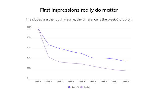
Let me give you a hint. In the picture below, I put one trend on top of another to compare them easily. Can you see it now?
The tails of the charts are roughly the same, all the difference happens within week one. The first impression does matter, and top-of-breed companies know how to make a great first impression.
If you are having a SaaS product, making a good first impression is a tough task. SaaS apps are usually complex apps, overloaded with information and fancy features. Complex apps have steep learning curves, and users have to climb the top to discover the app’s value.
Now, how many people take pleasure in climbing steep mountains? I can assure you that 80% of the population would prefer lying on a beach (or abandon complex apps for easier ones).

That is how median apps’ users see the product’s value
That’s why top apps learned to allocate small pinches of value along the users’ way. Those pinches are called “aha” moments.
For users, the pieces of value that occur right after the signup make climbing up the learning curve much more meaningful. For companies, it means better retention and higher customer lifetime value.

Example time! Let’s talk about Facebook’s “aha” moment
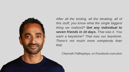
Facebook presents an iconic story of a groundbreaking “Aha” moment. Once upon a time, when MySpace had 115 million users and Facebook was a scrappy underdog with only 45 million users, the Facebook team discovered how the network effect impacted their user retention.
I give the floor to Chamath Palihapitiya, early Facebook executive:
Facebook is a social network, and until users connect with a minimum number of friends, they can’t feel the point of having such an app. When I first created my account many years ago, with zero friends added, I lost interest in an hour.
But as soon as I connected to a certain number of friends, I started getting their posts, likes, and comments under my posts, and thus my social life has officially launched.
The distance between the lonely boredom and wallowing in beautiful network effects for Facebook was seven friends and ten days. People who added seven friends in ten days had high chances to stay with Facebook forever. All the rest joined the churn list.
Just discover your “aha” moment is not enough
Facebook doesn’t leave “aha” moments to chance. The acquisition team did a ton of work to ensure newcomers will never get bored in their brand new accounts.
- Facebook pulls in a list of suggested friends from your Gmail account.
- It recommends friends from your school, college, and the company you work for — “you may know them.”
- It puts a big square blue “Add friend” button everywhere not to forget how to treat your friends on Facebook.
Your chances to have less than seven friends in ten days are slim to none. Facebook’s chances to become the most popular social network in history are higher than ever before.
More examples from SaaS apps: Calendly, Monday, and Canva
Let’s look at three different apps and their approaches to show customers their value from day one. We have taken this as reference from Eleken’s article.
Calendly is an innovative scheduling service that replaced Google Calendar for everyone who set up meetings, from project managers to hairdressers.
After the signup, Calendly offers you to create your first meeting. And as you go, you see there is some stuff Calendly can do that Google Calendar can’t:
- “aha, with Calendly, I can indicate the place of meeting.”
- “aha, I can add buffer time before and after meetings.”
- “aha, the app allows integrating payment systems.”
- “aha, I can create automatic workflows around meetings.”
Monday is a multifunctional team management app that works equally well for running an editorial calendar of a sales CRM system. For apps so universal, a steep learning curve becomes an incredibly challenging issue.
So for Monday, the road to users’ “aha” moment starts from personalization. After a user signs up, the interface asks them to specify their position and a purpose for which they need the Monday app.
After all the information is collected, the app offers targeted pieces of value that will differ for an editor and sales agent.
Canva is an online app for graphic design, and it is the most accessible design tool on the planet Earth. That is the value they want users to feel, and they remove all the onboarding obstacles between users and their first designs. You don’t even need to sign up to create the first picture.
For people who gained their first graphic design experience with Photoshop (the most complicated design tool on Earth), the Canva’s “aha, design can be so easy” becomes unforgettable.
So how do you discover your product’s “aha” moment?
1. Detect your “aha” moment.
What is the first pinch of value you can present to your users? For Facebook, for instance, it was their network effects.
2. Pave the way to it.
Facebook discovered that adding seven friends in 10 days is enough for users to feel the value. Now, what is the way to your “aha” moment?
3. Build it into your onboarding process.
Create an interface so that it points users toward the “aha” moment. Like, Facebook added reminders to connect with people whom you may know.
